Showing posts with label Principles of Design. Show all posts

Thursday, December 17, 2015

Patio

Patio

This week in Interior Design we learned about scale and proportion. We made an Emily Henderson inspired Polyvore by using Target Threshold.

Monday, December 14, 2015

Rhythm

      This week in Interior Design we learned about Rhythm. Rhythm uses pattern to create interest and unity in a design. Rhythm is created when certain lines, colors, forms or textures are used in a consistent pattern. Rhythm can also be used to create a feeling or order.

Repetition: establishes rhythm through the repetitive use of an element. It establishes a continuity and flow of a rhythm. For example, the pictures on the wall shows repetition because it's repeating a similar like picture. 

In this picture the repetition is on the carpet or the rug. Again, it's repeating an object or pattern. 


 Radiation: related to radical balance. Radiation can give a room a circular, sweeping, rhythmic movement. It can also be seen through furniture in a circular grouping. The room itself is in a circular motion along with the table shape and placement. 


The second picture for radiation is the staircase. It gives off the circular shape and the rhythmic movement. 


Gradation: the gradual increase or decrease of similar elements of design. This can include colors. The gradation of this picture is the color yellow. It shows many light to medium to dark yellows. 


The gradation for this picture would be the different sizes for the end tables. 


Emphasis

This week, the class each chose an object to put in an olioboard or a polyvore. I chose the object: fireplace. The fireplace is used in my olioboard as the emphasis object. The other objects in my room help bring it out. I added stockings to help the eye go towards it. The colors I used, the grays and whites are supposed to be bland to bring out the fireplace detail. 

Friday, December 11, 2015

Balance

Principles of Design: Balance
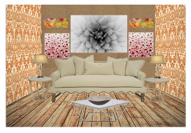
      I was asked to design a wall that could be asymmetrical or symmetrical. The process included the addition of pictures, lighting, and end tables to the design. 
Symmetrical: Formal Balance, one side of the room is the mirror image of the other, it's also the easiest balance to create. 
Asymmetrical: Informal Balance, visual weights are equal, elements are different in size, form, color, pattern, and spacing. Asymmetrical has a more lasting appeal.