Thursday, December 17, 2015

Patio

Patio

This week in Interior Design we learned about scale and proportion. We made an Emily Henderson inspired Polyvore by using Target Threshold.

Monday, December 14, 2015

Rhythm

      This week in Interior Design we learned about Rhythm. Rhythm uses pattern to create interest and unity in a design. Rhythm is created when certain lines, colors, forms or textures are used in a consistent pattern. Rhythm can also be used to create a feeling or order.

Repetition: establishes rhythm through the repetitive use of an element. It establishes a continuity and flow of a rhythm. For example, the pictures on the wall shows repetition because it's repeating a similar like picture. 

In this picture the repetition is on the carpet or the rug. Again, it's repeating an object or pattern. 


 Radiation: related to radical balance. Radiation can give a room a circular, sweeping, rhythmic movement. It can also be seen through furniture in a circular grouping. The room itself is in a circular motion along with the table shape and placement. 


The second picture for radiation is the staircase. It gives off the circular shape and the rhythmic movement. 


Gradation: the gradual increase or decrease of similar elements of design. This can include colors. The gradation of this picture is the color yellow. It shows many light to medium to dark yellows. 


The gradation for this picture would be the different sizes for the end tables. 


Emphasis

This week, the class each chose an object to put in an olioboard or a polyvore. I chose the object: fireplace. The fireplace is used in my olioboard as the emphasis object. The other objects in my room help bring it out. I added stockings to help the eye go towards it. The colors I used, the grays and whites are supposed to be bland to bring out the fireplace detail. 

Friday, December 11, 2015

Balance

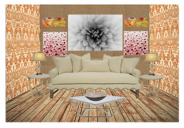
Principles of Design: Balance
      I was asked to design a wall that could be asymmetrical or symmetrical. The process included the addition of pictures, lighting, and end tables to the design. 
Symmetrical: Formal Balance, one side of the room is the mirror image of the other, it's also the easiest balance to create. 
Asymmetrical: Informal Balance, visual weights are equal, elements are different in size, form, color, pattern, and spacing. Asymmetrical has a more lasting appeal.


Friday, December 4, 2015

Gatsby

Gatsby

Gatsby

     This week I was asked to design two spaces for a client who is inspired by Gatsby. I used Polyvore to create these designs. Here's the link: http://www.polyvore.com/cgi/home The first space I decided to incorporate colors which were in the Buchanan's house. https://us.farrow-ball.com/the-great-gatsby/content/fcp-content
The light pink and earth tone colors inspired me to fill a space with all of those. In Jack Clayton's 1974 film the houses appear to be virtually monotone- perfect white palaces with the paneled walls and woodwork in the same color to create maximum connection with the exterior. Strong White or Skimming Stone would be best used to create this beautiful serene feel. Accent the scheme with blue off-whites like Cabbage White or Pavilion Blue. This style is clean, simple and very easy to live with. https://us.farrow-ball.com/the-great-gatsby/content/fcp-content
      I included the tan pillow because of the rich materials it's made of. The early Hollywood influence on the '20s is evident in the popularity of shiny, luxe fabrics like silks and satins. http://www.styleathome.com/decorating-and-design/styling-secrets/get-the-look-great-gatsby-style/a/50734/3
Above is a link to the information included about the silk bedding. In the template that I designed, I included a soft pink, mirrored piece of furniture. Reflective furniture was all the rage in the '20s, and it wasn't rare to see mirrored tables and chests in the homes of high society like Jay Gatsby. http://www.styleathome.com/decorating-and-design/styling-secrets/get-the-look-great-gatsby-style/a/50734/2
I incorporated the dancing poster in my first Polyvore because it added the time period to the room. The furniture also includes a lot of geometric shapes which were included in "The Great Gatsby" movie. The white marble fireplace represents the accent of money or having lots of money. In the 1920's. America was experiencing a lot of economic growth whether legal (new technologies and stock market investments) or illegal (prohibition or the booze trade) so there was a huge increase in the "newly rich" crowd. http://www.hollestewartdesign.com/add-sparkle-and-glamour-to-your-home-interiors/

     The second Polyvore I created for my client is pictured above. I added the glittering Gatsby colors which include blue, yellow, and grey. Baz Luhrmann's 2013 release highlights the more geometric and angular elements of 1920's decoration which included the use of chrome, mirrors and glass-summing up the age of the silver screen. There's a black mirror above to add that effect.


     Bold colors were used in some homes, especially in halls, and virtually always in combination with black. Green was the most used color, but should be bright and full of life. The black side table above is a lacquered piece of furniture. High gloss furniture has been an evoking sense of decor glamour and drama. I introduced this piece to give the space an opulent touch. http://www.styleathome.com/decorating-and-design/styling-secrets/get-the-look-great-gatsby-style/a/50734/5

I also included a silky pillow in the mix to add rich materials to the room. I incorporated the man playing the trumpet art because in the movie "The Great Gatsby", a man is playing a trumpet when they are all partying in the plaza.


Gatsby ( Buchanan House )

Gatsby  ( Buchanan House )