Thursday, December 17, 2015

Patio

Patio

This week in Interior Design we learned about scale and proportion. We made an Emily Henderson inspired Polyvore by using Target Threshold.

Monday, December 14, 2015

Rhythm

      This week in Interior Design we learned about Rhythm. Rhythm uses pattern to create interest and unity in a design. Rhythm is created when certain lines, colors, forms or textures are used in a consistent pattern. Rhythm can also be used to create a feeling or order.

Repetition: establishes rhythm through the repetitive use of an element. It establishes a continuity and flow of a rhythm. For example, the pictures on the wall shows repetition because it's repeating a similar like picture. 

In this picture the repetition is on the carpet or the rug. Again, it's repeating an object or pattern. 


 Radiation: related to radical balance. Radiation can give a room a circular, sweeping, rhythmic movement. It can also be seen through furniture in a circular grouping. The room itself is in a circular motion along with the table shape and placement. 


The second picture for radiation is the staircase. It gives off the circular shape and the rhythmic movement. 


Gradation: the gradual increase or decrease of similar elements of design. This can include colors. The gradation of this picture is the color yellow. It shows many light to medium to dark yellows. 


The gradation for this picture would be the different sizes for the end tables. 


Emphasis

This week, the class each chose an object to put in an olioboard or a polyvore. I chose the object: fireplace. The fireplace is used in my olioboard as the emphasis object. The other objects in my room help bring it out. I added stockings to help the eye go towards it. The colors I used, the grays and whites are supposed to be bland to bring out the fireplace detail. 

Friday, December 11, 2015

Balance

Principles of Design: Balance
      I was asked to design a wall that could be asymmetrical or symmetrical. The process included the addition of pictures, lighting, and end tables to the design. 
Symmetrical: Formal Balance, one side of the room is the mirror image of the other, it's also the easiest balance to create. 
Asymmetrical: Informal Balance, visual weights are equal, elements are different in size, form, color, pattern, and spacing. Asymmetrical has a more lasting appeal.


Friday, December 4, 2015

Gatsby

Gatsby

Gatsby

     This week I was asked to design two spaces for a client who is inspired by Gatsby. I used Polyvore to create these designs. Here's the link: http://www.polyvore.com/cgi/home The first space I decided to incorporate colors which were in the Buchanan's house. https://us.farrow-ball.com/the-great-gatsby/content/fcp-content
The light pink and earth tone colors inspired me to fill a space with all of those. In Jack Clayton's 1974 film the houses appear to be virtually monotone- perfect white palaces with the paneled walls and woodwork in the same color to create maximum connection with the exterior. Strong White or Skimming Stone would be best used to create this beautiful serene feel. Accent the scheme with blue off-whites like Cabbage White or Pavilion Blue. This style is clean, simple and very easy to live with. https://us.farrow-ball.com/the-great-gatsby/content/fcp-content
      I included the tan pillow because of the rich materials it's made of. The early Hollywood influence on the '20s is evident in the popularity of shiny, luxe fabrics like silks and satins. http://www.styleathome.com/decorating-and-design/styling-secrets/get-the-look-great-gatsby-style/a/50734/3
Above is a link to the information included about the silk bedding. In the template that I designed, I included a soft pink, mirrored piece of furniture. Reflective furniture was all the rage in the '20s, and it wasn't rare to see mirrored tables and chests in the homes of high society like Jay Gatsby. http://www.styleathome.com/decorating-and-design/styling-secrets/get-the-look-great-gatsby-style/a/50734/2
I incorporated the dancing poster in my first Polyvore because it added the time period to the room. The furniture also includes a lot of geometric shapes which were included in "The Great Gatsby" movie. The white marble fireplace represents the accent of money or having lots of money. In the 1920's. America was experiencing a lot of economic growth whether legal (new technologies and stock market investments) or illegal (prohibition or the booze trade) so there was a huge increase in the "newly rich" crowd. http://www.hollestewartdesign.com/add-sparkle-and-glamour-to-your-home-interiors/

     The second Polyvore I created for my client is pictured above. I added the glittering Gatsby colors which include blue, yellow, and grey. Baz Luhrmann's 2013 release highlights the more geometric and angular elements of 1920's decoration which included the use of chrome, mirrors and glass-summing up the age of the silver screen. There's a black mirror above to add that effect.


     Bold colors were used in some homes, especially in halls, and virtually always in combination with black. Green was the most used color, but should be bright and full of life. The black side table above is a lacquered piece of furniture. High gloss furniture has been an evoking sense of decor glamour and drama. I introduced this piece to give the space an opulent touch. http://www.styleathome.com/decorating-and-design/styling-secrets/get-the-look-great-gatsby-style/a/50734/5

I also included a silky pillow in the mix to add rich materials to the room. I incorporated the man playing the trumpet art because in the movie "The Great Gatsby", a man is playing a trumpet when they are all partying in the plaza.


Gatsby ( Buchanan House )

Gatsby  ( Buchanan House )

Tuesday, November 17, 2015

Element of Design : Space

Element of Design: Space

This week in Interior Design we used www.gabberts.com/interior-design-studio/room-planner/
Above is a website, I created my space through this program. I was able to divide each room by using counter tops for my kitchen space. The living room is divided by the furniture signifying that the room is in fact a living room. My bathroom was the only space that we were able to use a wall. I didn't divide room very much because there wasn't a reason to do so. I wouldn't mind having my bed in the open. The dining room isn't divided, but it is in it's own little section. Overall, the program helps a lot with creating different spaces throughout a house or even a studio apartment which we were to design.


Tuesday, November 10, 2015

Elements of Design: Texture

Element of Design: Texture
Visual Texture: appearance of a surface
~the floor
~the chandelier 
~the basket in the corner
~the mirror on the wall
Tactile Texture: feel of a surface
~the blanket .. soft and furry
~pillows .. soft
~the dresser .. smooth 
~the plant .. rough and smooth on the leaves
Audible Texture: the sound a surface makes when rubbed
~the floor .. creeks 
~the mirror spikes .. it would make a ringing sound after dragging the finger on it
~the plant .. rustling sound if someone would to brush against it
~the window .. which would make a screeching sound

The overall feeling of the room because of the textures creates a more comfortable space to be in. When you know about the textures, it makes you want to be in there. 
When we learned about textures in Interior Design, it was interesting to learn about the different types of texture. 

Friday, November 6, 2015

Elements of Design

Element of Design: Line

This week in Interior Design we learned about lines. We watched a video about lines and looked on http://www.houzz.com/ to find rooms that were designed with lines.
Horizontal Line:

You can see the horizontal lines within the drawers. We tend to focus on the drawers because they are on the stairs and that drawers are mainly horizontal.

The horizontal lines are shown on the cabinets and on the island in the kitchen. The eyes would go straight the cabinets because of the beautiful wood and the style which is horizontal lines.
Horizontal lines create a room to appear wider or longer. Long horizontal lines can visually expand space. Although, a room with too many horizontal lines may become boring and lack interest.

Vertical Line:


The vertical lines appear on the wall as bricks. The eyes tend to go straight to the wall because of it's boldness.
The vertical lines appear as the framework of the windows. Vertical lines have the eyes look at the room as a whole. It makes the viewer look up and down instead of straight ahead. The use of vertical lines tend to make the interior seem higher. If there are too many vertical lines, it may cause feelings of uneasiness or confinement. 

Diagonal Line:


The diagonal line is located on the rug of this room. The eyes might not go straight for the rug because there is a lot going on in the photo, but the rug shows the diagonal line with great color.
The diagonal line in this photo is located within the tile. The yellow in the tile really shows this and for me, that's where my eyes go. The blast of color really shows the diagonal line.
 Human interest is usually sustained longer with diagonal lines than straight lines, probably due to the fact that the eye and mind are so stimulated. However, too many diagonal lines, particularly on a wall, can be overstimulating and tiresome.

Curved Line:

The curved line appears in the tree at the center of this room. Our eyes tend to go straight for the tree because of the unique style.
The curved line in this picture appears on the staircase. Your eyes would appear to go towards this line because of the object. It is in the center of the room that the picture has been taken. Curved lines provide relief, softness, and balance. They can give an elegant, human quality to interiors. A series of curved lines may give a rhythmic accent to the room, suggesting graceful movement. If there are too many curved lines it might be viewed as too feminine.

We learned so much this week about lines and how they should be used in a space. The website gave us ideas and different visions on many room selections. I would definitely suggest going to the website above to look at creative ways on styling a space!


Sunday, October 25, 2015

Summit Avenue


Summit Avenue 
 
The Summit Avenue tour was a great way to learn about the different houses in Minneapolis. The houses we saw on Summit Avenue were million dollar houses. We first saw the James J. Hill house. The tour guide gave a lot of great information about James J. Hill and the history of the house. We then saw his son's house which was right next door. Again, this house was flawless from the outside. We saw the F. Scott Fitzgerald house which is basically a bunch of town houses put into one.
The James J. Hill house was where we met as a tour group. I got to go inside to use the restroom before the tour and our guide showed us some areas of the house. I got to see the laundry room and parts of the downstairs.
The James J. Hill house had a couple of Dormer Windows which seemed to be very popular when the house was built.
This house belongs to one of the son's of James J. Hill. The window is a Palladian Window.
This is part of the front of James J. Hills son's house. This is a portico with a pediment roof with columns.
This is house shows columns in the upper window.
 
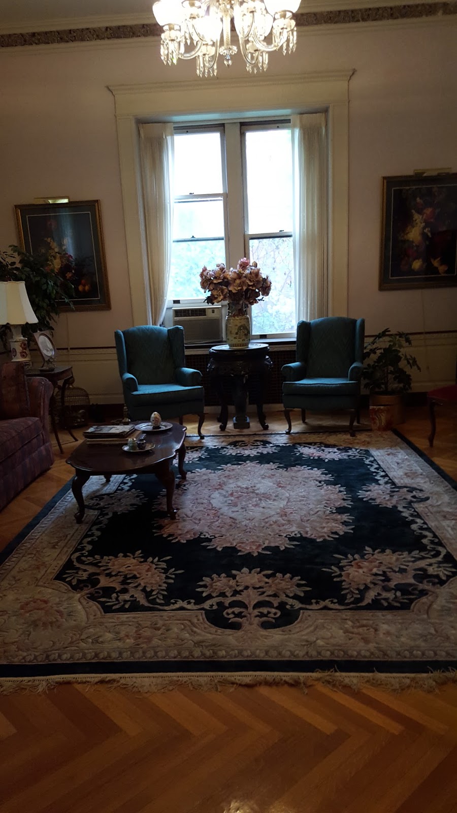
Above is one of the houses we went into. The owner let both of our tour groups inside. The outside of the house looks like it would be really dark and not really pretty on the inside. That all changes.
This was a little seating area that we saw.
This picture shows the living room of the house. Across from the couch is a grand piano. The fireplace was so beautiful just to look at. The room was full of white which gave me the idea of elegance. A lesson that I learned was don't judge a house by the outside. The exact lesson for everything else. The house that we went inside of was my favorite because I actually got to see the inside of it. I like the unique plant growing on the house. It made it different and it was just a beautiful house and nothing what I saw inside was expected.
History of Summit Avenue
The history of Summit Avenue dates back to the early 1850s, when Saint Paul was in its infancy. Mansions were starting to appear on top of the hill in the earliest days of the city.The district began to decline in the 1930s as many old mansions either turned into rooming-houses or went vacant for many years. The housing stock was not decimated by commercial development pressure, as the bluffs separating the Summit Avenue area from downtown St. Paul made it difficult for downtown to expand into the area. The area began to turn around in the 1960s and 1970s, as young couples discovered that the Victorian homes could be purchased affordably and could be restored over time. Neighborhood associations also formed and helped with preservation efforts. The Hill District is again one of the most fashionable places to live in Saint Paul.

Below is the link to get your own walking tour!
http://sites.mnhs.org/historic-sites/james-j-hill-house/summit-avenue-walking-tour

The link includes a description of the tour, times that the building is open and admission prices. There is a walking tour of Summit Avenue and of the James J. Hill house!
Enjoy!